

Blogging 201, Branding and Growth: Day Three: Get Read All Over

“My mobile phone battery runs out all the time because all the messages come straight to me”
Ed Balls
Get Read All Over, Part Two (or Mobile Madness)
Over the past few days, you’ve been brainstorming about your brand and thinking about the elements of a well-designed site. None of that matters if readers can’t view your site properly across various devices.
Today’s assignment: make sure your site is mobile-friendly, and familiarize yourself with the features of responsive design.
I have been using the WordPress application on both Samsung and Iphone for a while. Sometimes for writing, but mostly for reading and follow up. I don’t recommend typing on the small device for a lengthy time. Posting on them, especially picture related topics can be tricky, as it sometimes is even with a proper computer 😉
I have showcased my blog on several occasions on the phone application and the look and feel is right for such a device as well. The theme and widgets flow nicely even on a smaller screen. Best test to prove the point is, to take a complete novice to both smart phones and the world of blogging. After a few minutes with application install and demo on how the blog works, they got the hang of it and I am happy to say, are now regular followers as well.
Having a background in web design and code, I usually do tests on the pages on several browsers and types of screens. With the Visual Theme, I have finally realized the looks for my personal blog.
Here are some examples of the blog as seen throught my mobile phone:
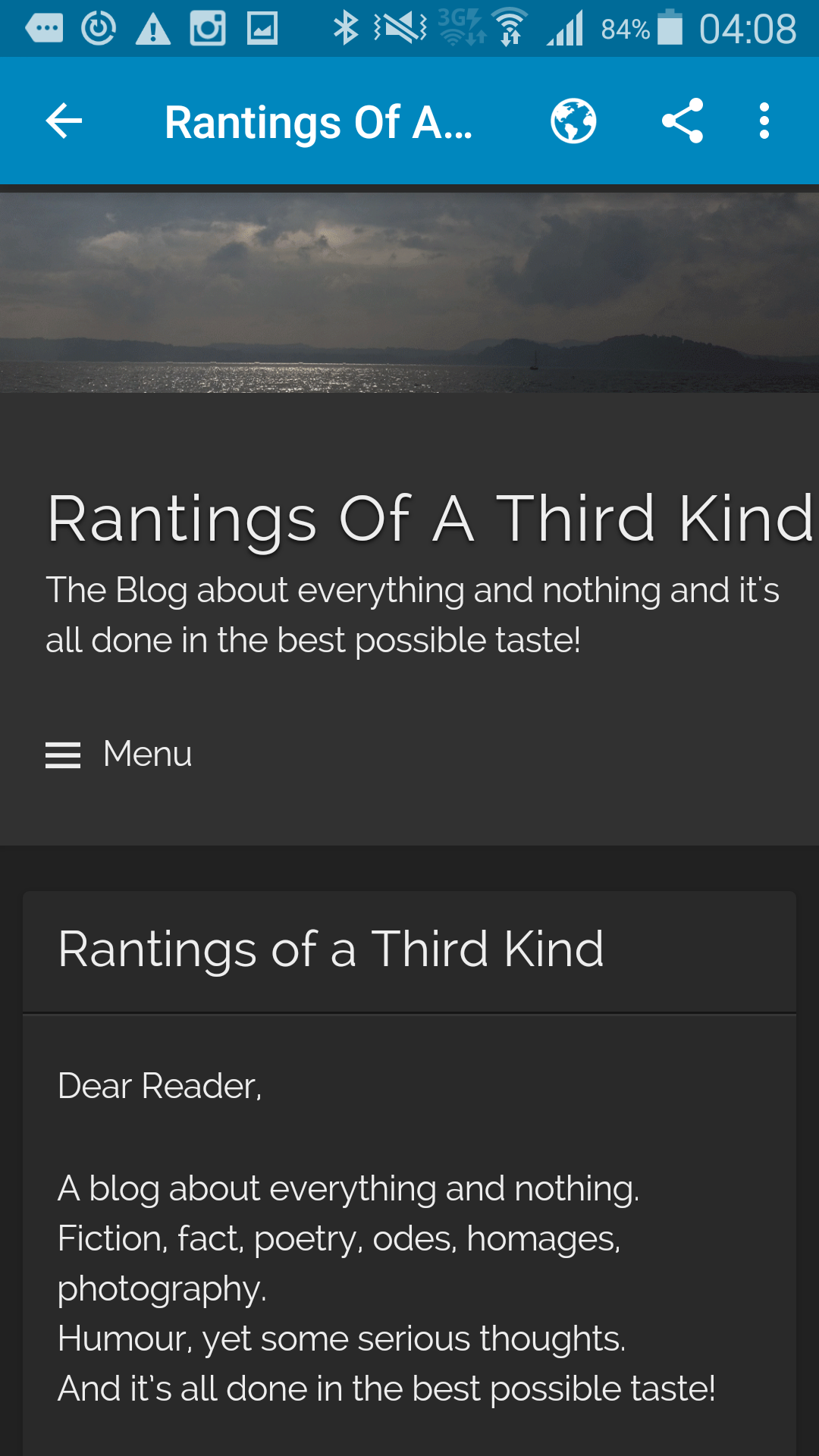


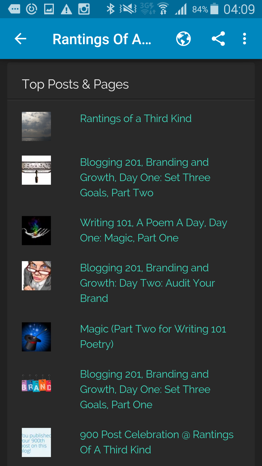
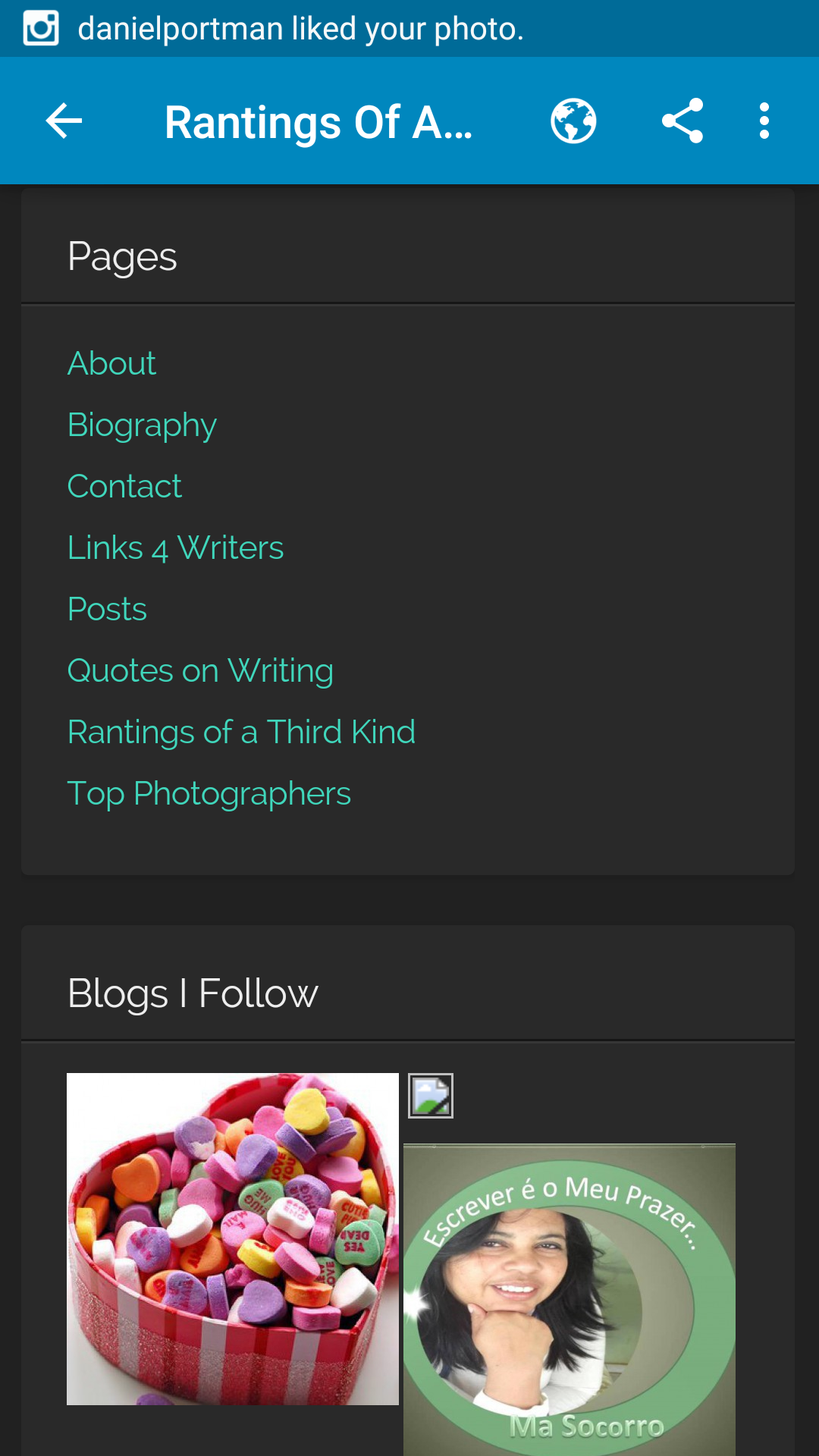


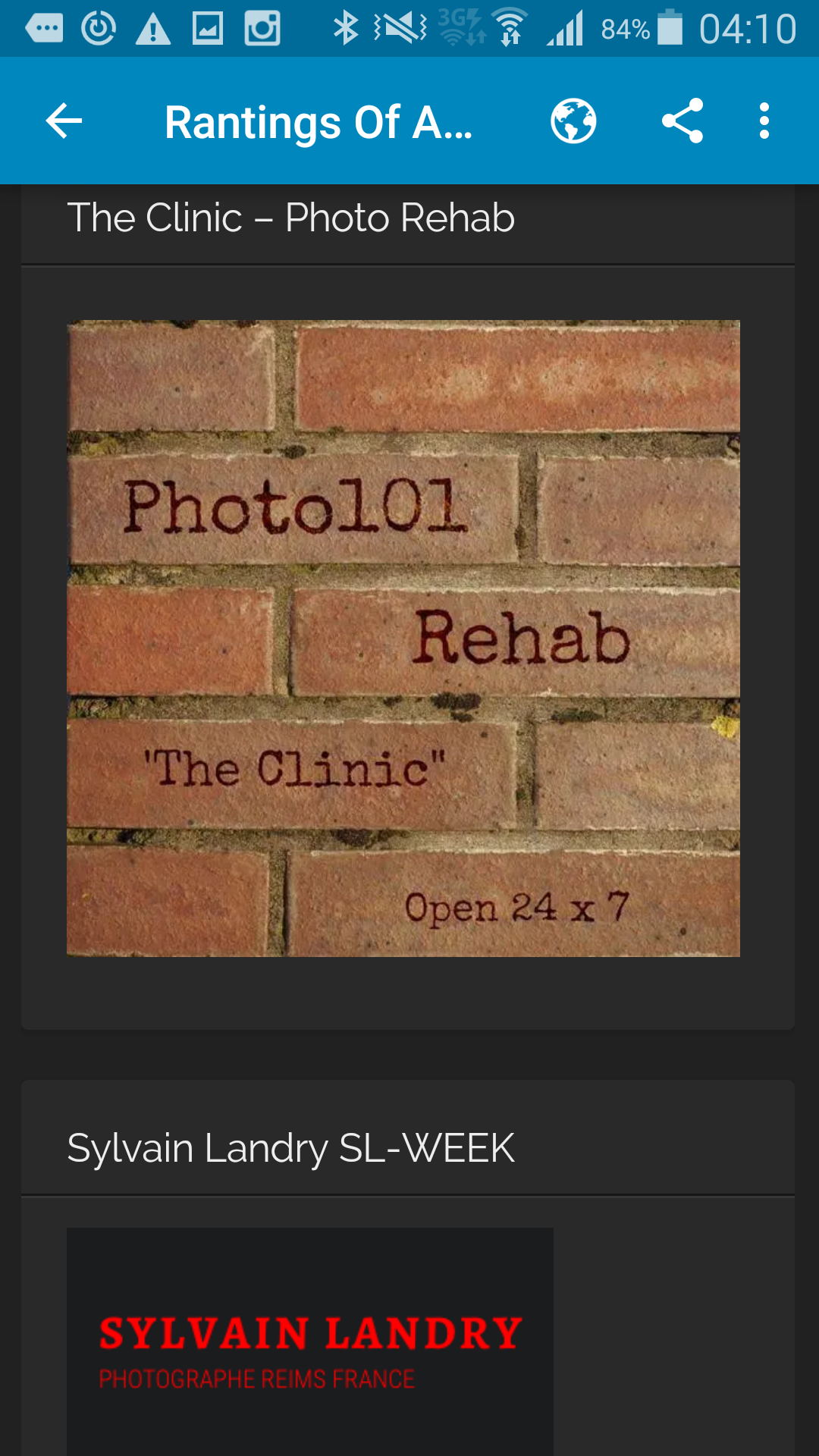


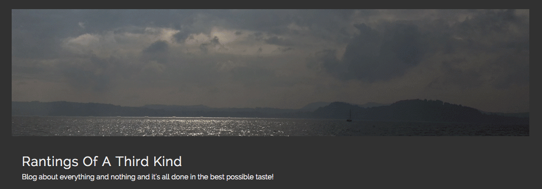


 Rantings Of A Third Kind